Eight years of capgemini.com home page design
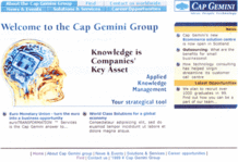
I'm still enjoying a long awaited (by French standards ;-)) vacation break, hence my light blogging. As an appetizer to the promised story about the redesign of capgemini.com, here is a little look back at eight years of home page design of capgemini.com, starting with the oldest one I could find in our archives, code-named "Birdy" and published in 1997:
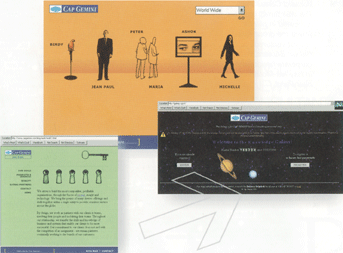
The home page is the orange one, with an inner page on the left with a green background. (The screenshot on a black background was taken on our intranet "Galaxy" at the time.) It was made by a British agency and full of metaphors. Apparently too metaphoric, it was deployed only on our corporate site and no other units adopted it.
A year later, the Group Directoire decided that it was time to impose a single look & feel to all our sites and stopped the hot potato from bouncing between IT and communications. Corporate Communications was charged to produce a standard look & feel and hire a "corporate webmaster" to "stop the chaos". I was hired with those exact title and mission in June 1998, my first task being to impose this upon our 20 or so web sites:
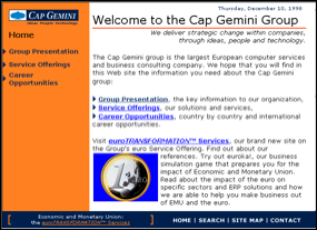
(See an inner page.)
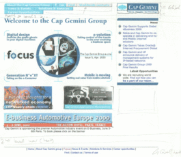
Three frames and a rotating markee at the bottom, can you tell it's been designed by IT people? ;-) Nevertheless, this was our very first standard "look & feel" and I got it rolled-out on our international sites. A first in the Group traditional history of "one site equals one brand new look & feel"! (Because, you know, the Internet is all about change and evolution and being sexy, plus it's fun, every unit should have its own site!) I learned only a year later that two or three previous attempts had failed, and that I had been the first to herd cats and succeed. I made it because nobody told me it was impossible ;-). Anyway, I couldn't stand this design, neither many of my peers, so we quickly got together to produce a second version. Which brings us to...
(Click to zoom.) Those are working drafts (I'm terrible at keeping images of the past) and the end result was in between (closer to the second image but without the printing bug of the top banner). I was already trying to sell the idea that space, using white space and cutout images, was better than stuffing the home page with tons of heavy graphics on flashy backgrounds. 2D 1/2 rollover buttons were "in" at the time, as were tiny and unreadable (on screen) signatures below our logo :-). Surprisingly, convincing people (especially IT developers) that Frames Suck (Most of the Time) was a bit difficult. It was also not obvious, although easier, to convince people that having the navigation and peripheral elements on the right was actually helping people to read the content on the left.
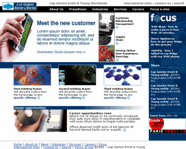
This design didn't last long. At the end of 1999 we started discussions with Ernst & Young to acquire their consulting practice, and the new company was renamed Cap Gemini Ernst & Young in May 2000. In the midst of the merger, a quite worrying possibility emerged with the consulting practice attempt to create their own sites with their own look & feel. But let's just say that the competition wasn't fair: PowerPoint and Lotus Notes experts in front of an already organized web team with a consistent and agreed model of one global site plus one site per country. Within three months we agreed on a new design, which was rolled-out early 2001 (click to zoom):
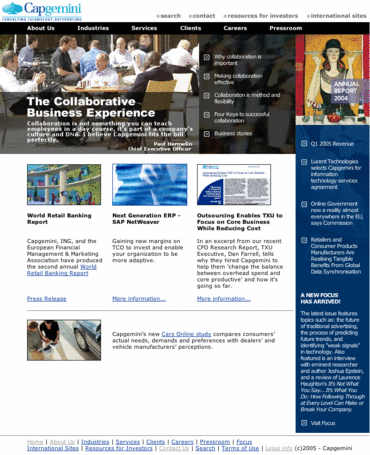
Again, this is a working draft, but quite close to the final result. It maintained the principle of a main navigation with a top banner, with drop-down menus, and a denser layout for the home page (a main lead graphic plus three small teasers). This design lasted a loooong time, until we changed our name to Capgemini in April 2004 with a quite simple solution (swapping the logo with the new one, click to zoom):
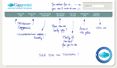
This design lasted until last month. Then I did something I've always dreamed of doing before launching a new site (click to zoom):
I wanted to tease a little bit our audiences before the launch, while explaining our new site structure. I did the handwriting, showed it to a couple of people (hi boss!) and silently replaced our home page with it five days before the launch. A few people thought our site had been hacked! It was quite fun and very well received.
To see how the site looks today, check www.capgemini.com. Quite different, isn't it?
